
Responsive design has turned into a foundation of modern web development, ensuring seamless user experience across different devices and screen sizes. However, carrying out responsive designs in ExtJS themes presents extraordinary difficulties. Are you struggling with responsive design challenges while using your ExtJS Themes? Look no further than EXTNUKE, your go-to destination for top-quality Ext JS Themes and Components.
In this article, we dive into the innovative components given by ExtNuke, an incredible asset for ExtJS themes and components, to defeat these difficulties and make dynamic, responsive UIs.
Understand Responsive Designs Challenges
Responsive design includes adapting a website’s layout and content to fit different screen sizes, from laptops to cell phones. For ExtJS themes, this implies ensuring that components resize and reposition suitably, keeping up with appealing and aesthetic across gadgets. Challenges frequently emerge in managing complex layouts, taking care of dynamic information, and optimizing execution while keeping up with responsiveness.
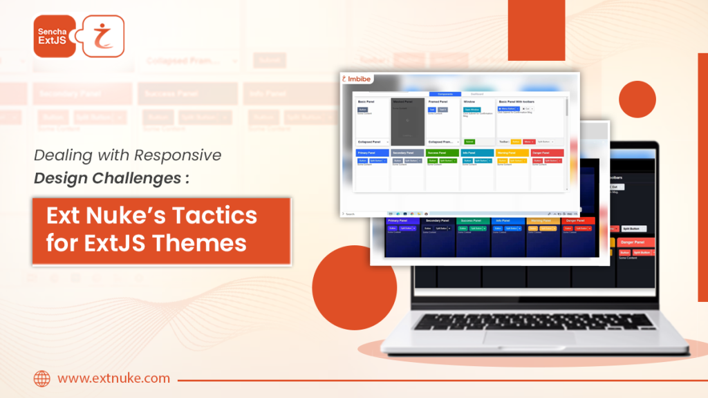
Ext Nuke’s Tactics for Overcoming Responsive Design Challenges
ExtNuke offers a comprehensive set of themes embedded with standard and dashboard packages. Every one of our theme packages is built for a specific Ext JS toolkit and targets a specific major version of Ext JS. Although we take every care for a theme to support the maximum possible set of components from the target Ext JS latest version and toolkit.
ExtNuke provides a compact set of features and techniques in these themes to address responsive design challenges.
Grid Layout Optimization:
With special attention to grids and trees, we provide crisp, sharp edges, clean headers, and widget columns, enhancing your Ext JS data presentation with a professional, standout interface, allowing developers to configure responsive behavior for grids, ensuring optimal presentation of tabular data on any device.
Component Flexibility:
ExtNuke enhances ExtJS components with flexible sizing and positioning, enabling them to adapt seamlessly to different screen sizes without sacrificing functionality or aesthetics.
Configurable Buttons :
Take control with out-of-the-box button options, allowing you to easily adjust size, color, alignment, and more to highlight actionable elements on your pages and forms.
Corporate Clean Look and Beautiful Forms :
Enjoy a minimalistic yet visually appealing interface with our Catalog theme, designed for enterprise applications. Its clean, Bootstrap-inspired design is easy on the eyes for regular and power users alike. Our themes revamp ExtJS forms, giving them a stunning Bootstrap-inspired look, transforming textboxes, comboboxes, date fields, and more into eye-catching components.
Why to Consider Ext Nuke’s ExtJS Themes and Components ?
In the period of ubiquitous digital access, responsive design is as of now not an extravagance yet a need for web applications. ExtNuke offers comprehensive ExtJS themes and components that elevate your web development game. We opt for a team who understand the hassle of creating the same codes and lines again and again. We understand the importance of creating exceptional web experiences. Equipping with the tools and techniques needed to create dynamic and user-friendly themes that adapt effortlessly to the ever-evolving digital landscape. With ExtNuke, crafting responsive ExtJS themes is not just a challenge—it’s an opportunity to redefine the boundaries of user experience excellence.

Pingback: Dealing with Responsive Design Challenges: Ext ...