Enterprise dashboards have changed dramatically over the last decade. The reporting screen, once a simple report, has become the central workspace where teams can monitor performance, dig into problems, compare trends and make decisions. With organizations collecting more data from applications, customers, operations and monetary systems, the challenge is more than simply displaying information. The trick is to deliver that information in such a way that people can quickly understand and act on it.
That’s when smart dashboard design becomes crucial. A good interface combines charts, tables, filters, alerts and summaries without cluttering the screen. This provides users with sufficient context to understand what is happening and allows them to switch between a high-level overview and the underlying details. That sweet spot between information density and usability can be the difference between a dashboard that becomes an invaluable daily tool or just another screen that users learn to ignore, particularly for enterprise applications.
Why Enterprise Dashboards Require More Than Eye Candy
A dashboard can be visually impressive and still fail its users. Pretty colours, animated charts, and neatly arranged cards count for little if the information architecture is confusing. Enterprise users typically arrive at a dashboard with a specific question in mind: Are sales improving? Which region is under performing? Are service levels on target? What’s different from last week?
The interface needs to answer those questions with as little friction as possible.
A useful dashboard creates a visual hierarchy. The most important metrics should be right there front and center. Supporting info should be available but not fighting for attention. Charts are there to help you see the pattern, not just to turn numbers into graphics. When the user is exploring a single record, tables should provide rich information.
Interactivity is also important. Enterprise data rarely makes sense when viewed through just one lens. Users may need to filter the results by region, department, product, customer segment or time period. They may also want to compare current performance to historical figures. Good dashboard experiences answer these questions and don’t make users jump between multiple disconnected screens.
Dynamic Charts & The Power of Context
Charts are particularly useful when they reveal relationships that are hard to discern in the raw data. A trend line can indicate slow changes, and a comparison chart can indicate differences between departments or regions. But the value of visualization is situation-dependent.
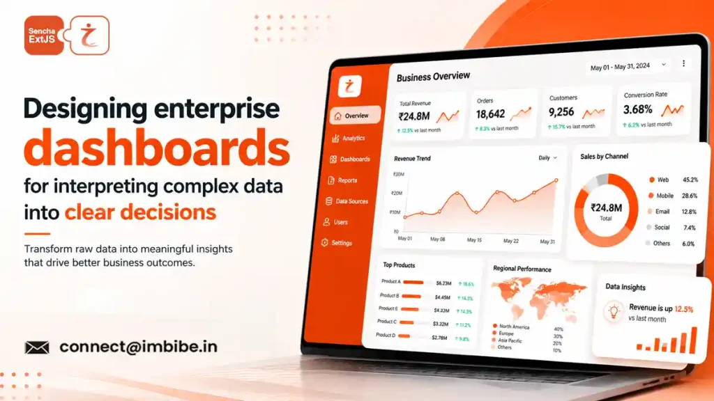
The principle can be nicely illustrated with a dashboard ext js with dynamic charts. Charts are responsive to filters and new data, enabling users to explore a dataset rather than view a static report. Selecting a business unit could update revenue, customer activity and operational metrics across the page, letting the user see how one change impacts the big picture.
What matters is not so much whether the charts are interactive, but whether the interaction has a purpose. All interactive elements should help users answer questions. Excessive animation, too many transitions, or too many controls can take the focus away from the information itself.
The same is true of the choice of charts. A line chart is usually a good choice for showing trends over time, whereas a bar chart can be more effective for comparing categories. A table might be better if you require precise figures. At the end of the day, choosing the right visualization is a communication exercise, not a decoration exercise.
Designing Consistency into Enterprise Interfaces
Most large organizations do not have a single dashboard. They could have separate interfaces for finance, sales, operations, customer service, logistics and management. Without a coherent design language these applications can begin to feel like different products.
This is one of the reasons why organizations often consider an ext js enterprise ui framework while designing complex business interfaces. A structured approach to UI helps teams establish consistent patterns for navigation, forms, data presentation, filtering, and responsive behavior. Consistency requires less mental effort from users to learn each application.
Consistency does not imply that all screens need to have an identical layout, however. Different structures for different work flows. A financial application may rely on detailed tables, while an operations dashboard may focus on alerts and status indicators in real-time. A good design system offers reusable foundations but still provides enough flexibility for individual business contexts.
Data Grids in Business Applications
Charts are useful for identifying patterns, but enterprise users often want to drill down from an overview into detailed records. And here is where data grids come in.
An ext js theme with data grid support can help create a more cohesive experience by keeping detailed tabular information visually in line with the rest of the application. When grids support sorting, filtering, grouping, pagination and column management, the dashboard environment allows users to explore large datasets without leaving it.
In this sense, charts and grids are particularly useful. A user might notice a sudden dip in a chart and then use a related grid to drill down into the transactions, accounts or operational records behind that change. The dashboard is therefore an entry point to investigation rather than the destination for information.
And good grid design also knows that more information isn’t better. Column names should be meaningful, important fields easy to find, and dense datasets still readable. Configuration options that they rarely need shouldn’t be a burden to users when they should be able to customize their view when appropriate.
Designing Dashboards for Diverse Audiences
An executive and an analyst may look at the same business data, but they require very different experiences. A quick snapshot of overall performance, major shifts and areas that need attention is often required by executives. Analysts may want filters in detail, granular records, comparisons, and the ability to investigate anomalies.
A ext js corporate dashboard template can be a useful structure starting in this environment, but templates should not drive the final information architecture. Design should begin with the user’s decision and responsibilities, rather than a predefined set of widgets.
Audience specific dashboards can also reduce the cognitive load. But an app can choose to highlight role-specific information instead of showing every metric to every user. This improves the scanability of the interface, and can promote more intentional use of data.
Performance is part of the experience that users have
Performance Another design challenge is performance, because enterprise dashboards often have to work with large datasets. No one wants to wait for every chart and grid to load before they can begin working, no matter how visually elegant the dashboard may be.
Hence, performance considerations need to be integrated into the design of the interface from the beginning. Data loading strategies, pagination, filtering, rendering behavior, and the number of concurrent requests can affect the responsiveness of an application. Even small delays become noticeable when repeated throughout a user’s working day.
Also, perceived performance is important. Complex operations can be made more predictable with clear loading states, sensible progressive rendering, and instant feedback. Users need to know when the application is working on a request, waiting for data, or showing a complete result.
Long Haul Design
Enterprise dashboards are rarely static. Business priorities change. New data sources are created. Metrics get redefined. Teams create new workflows. A dashboard that works well now needs to be able to evolve without becoming more and more complicated.
This means that maintainability is an important aspect of the dashboard design. Consistent components, reusable interface patterns, clear data structures, and intentional visual hierarchies can make future changes easier to manage. It’s also worthwhile to periodically review what metrics and interactions users actually depend on. Sometimes, cleaning up old information can be as useful as adding new features.
The best enterprise interfaces are ultimately simplified the more powerful they become. Users don’t need to understand the complexity behind the dashboard to use it effectively. That complexity is in the underlying architecture and the interface should make the results clear and accessible.
Summary
Enterprise dashboards are most effective when they are built as decision-making environments, not as collections of charts and tables. Trends can be exposed through dynamic visualizations, data grids can aid in detailed investigation, and complex applications can be made easier to navigate with consistent interface patterns. But none of these factors by themselves creates value.
The true measure of a dashboard is what a user does after they open it. Do they get the picture of the present quickly? Can they see what is not there? Could they investigate why that changed? And most important of all, did they make a better decision because the information was presented clearly?
When those questions guide the design process, enterprise dashboards are not just reporting tools. They become usable interfaces between people and the ever-more-complex data that drives day-to-day business decisions.